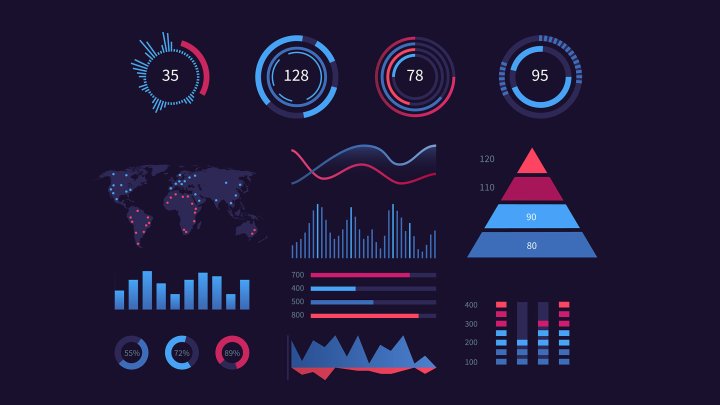
In this digital age, where information overload is a constant struggle, presenting complex information in a clear and compelling manner has become imperative. Data visualization is an invaluable tool for breaking down complexities and conveying information in an engaging and easily digestible way. This essay explores the profound impact of data visualization in communicating intricate data on websites, delving into its benefits, essential principles, and best practices.
The Power of Data Visualization
At its core, data visualization is the art of turning raw data into visual representations that resonate with the audience. This transformative process endows data with a visual narrative, enabling users to grasp patterns, trends, and insights instantaneously. By using charts, graphs, infographics, and interactive elements, websites can captivate users’ attention, facilitating comprehension and knowledge retention.
Simplifying Complexity
Data visualization serves as a bridge between complexity and simplicity. The human brain is inherently wired to process visuals better than text alone, making data visualization an indispensable tool for website owners seeking to communicate intricate information effectively. Through concise and clear visuals, data visualization curtails cognitive load and prevents users from feeling overwhelmed by information. It transforms intricate datasets into stories that the audience can easily internalize.
Choosing the Right Visuals

While data visualization holds great promise, employing the wrong visual representation can lead to confusion and misinterpretation. Selecting appropriate visuals requires a judicious understanding of the data’s nature and context. Line charts are ideal for displaying trends over time, whereas bar charts facilitate comparisons between categories. Heatmaps are effective for showcasing correlations and spatial distributions. By using the right visual format, websites can amplify the potency of their message and ensure users make accurate inferences.
Emphasizing Interactivity
Static visuals, while useful, might not fully exploit the potential of data visualization. Interactivity brings dynamism and personalization to the user experience. Interactive elements, such as filters and tooltips, empower users to explore data at their pace and according to their interests. When users actively engage with data, they are more likely to retain information and develop a deeper understanding of complex topics. Interactivity fosters a sense of empowerment, making the website an immersive educational platform.
Visual Storytelling
Data visualization is akin to a storyteller, weaving narratives that captivate and enlighten. Integrating storytelling techniques in data visualization enhances engagement and emotional connection with the data. By using compelling visuals and well-crafted annotations, websites can contextualize data, making it more relatable to users. A well-told story through data visualization not only conveys information but also elicits empathy, enabling users to appreciate the significance of complex data in their lives.
Maintaining Visual Clarity
Cluttered and convoluted visuals can negate the benefits of data visualizations. Achieving visual clarity involves simplifying designs, removing unnecessary embellishments, and adhering to consistent colour schemes and labelling conventions. Clarity ensures that the central message remains prominent, reducing the risk of misinterpretation. Additionally, responsive design must be a priority, as visuals should adapt seamlessly across various devices, guaranteeing a user-friendly experience.
Accessibility and Inclusivity
In the pursuit of engaging visualizations, websites must not overlook accessibility and inclusivity. Not all users perceive information in the same way, and some might have visual impairments. To ensure universal access, websites should provide alternative text for images, use colour schemes that are distinguishable to colour-blind individuals, and ensure compatibility with screen readers. By embracing accessibility, websites broaden their reach and enrich users’ experiences.
Data visualization is the key to unlocking complex information and unleashing its communicative power on websites. From simplifying complexity to fostering interactivity, its potential is boundless. By selecting appropriate visuals, integrating storytelling, and emphasizing visual clarity, websites can captivate and engage their audience in novel ways. Moreover, by prioritizing accessibility and inclusivity, they can ensure that the benefits of data visualization are extended to all. In this digital age, the art of data visualizations serves as a beacon of enlightenment amidst the vast sea of information.


